
What Design Aesthetics Define the Current Style of Fresh Perfumes in the Market?
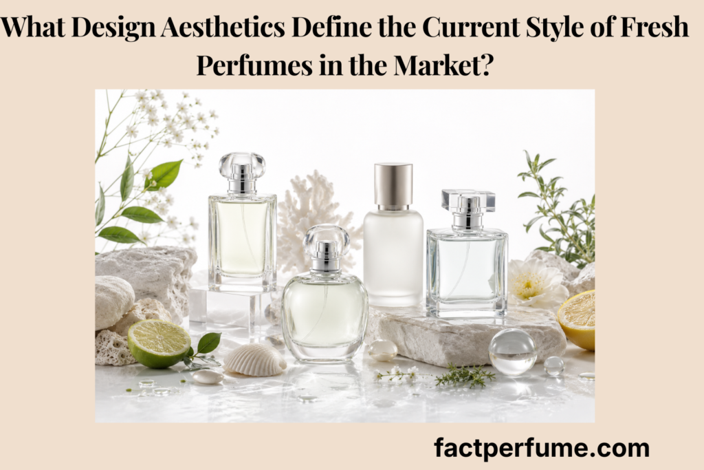
The current style of fresh perfumes is defined by clean glass, pale colors, restrained labels, minimal typography, transparent materials, and quiet visual cues that communicate clarity, airiness, cleanliness, and understated freshness.
This page explains fresh perfume design aesthetics through broad design evolution, visual sub-genres, visual degradation risks, design-language signals, and a final checklist for evaluating packaging as visual communication rather than proof of scent quality, safety, or authenticity.
How to Use This Fresh Perfume Design Guide
Use this guide as a visual reading path: first identify the design style, then separate visual suggestion from scent proof, check preservation, and evaluate whether the design language matches the fresh perfume message.
Why Has Modern Fresh Fragrance Design Shifted Toward Minimalism?
Modern fresh fragrance design has shifted toward minimalism because clean packaging visually communicates clarity, airiness, restraint, and quiet luxury more directly than heavy ornament or loud decoration.
Fresh perfume packaging still belongs inside the wider system of perfume types, but this page focuses only on visual design language. A fresh perfume often uses visual cues such as clear glass, pale color, and restrained labeling to prepare the wearer for a clean or airy scent impression.
Packaging can frame expectation before the scent is tested. It can suggest freshness, clarity, wateriness, clinical precision, botanical softness, or quiet refinement, but it does not prove formula quality, safety, authenticity, or performance.
Many Modern Fresh Perfumes Use Cleaner Materials
Many modern fresh perfumes use clearer glass, cleaner labels, lighter colors, and simpler bottle shapes.
This design shift reduces visual weight. Instead of relying on dense ornament, the bottle may use transparency, space, pale liquid, and restraint to make the fragrance feel lighter before it is worn.
Minimal Packaging Communicates Clarity and Restraint
Minimal packaging helps communicate clarity, airiness, cleanliness, and restraint because it reduces visual noise.
Visual noise means too many competing details: crowded type, heavy decoration, strong colors, ornate caps, or mismatched materials. Removing that noise can make clean perfume packaging feel more direct and composed.
The Bottle Prepares the User for Freshness
The bottle prepares the user to expect a fresh, sheer, transparent, or clean fragrance experience.
This expectation is useful, but it remains only a design signal. A restrained bottle may suggest a close scent trail, but fresh perfume sillage still depends on formula, skin, application, fabric, climate, and environment.
Quiet Design Cues Have Become Influential
Modern luxury often favors quieter design cues, but this trend should be described carefully without treating ornate packaging as outdated or inferior.
Quiet luxury packaging can suggest polish through proportion, weight, spacing, glass quality, and restraint. It is not automatically better, more expensive, or more authentic than expressive packaging.
Aesthetic Evolution Timeline
This timeline uses broad qualitative eras only and does not claim exact dates, market share, or complete replacement of one style by another.
| Era | Common Fresh Perfume Design | Visual Message | Market Effect |
|---|---|---|---|
| Decorative freshness | Color accents, ornamental labels, expressive caps, visible scent-family cues | Freshness as decoration, brightness, or personality | Helps the bottle read quickly, but may feel visually busier |
| Transparent freshness | Clear glass, pale juice, cleaner silhouettes, lighter labels | Clarity, airiness, transparency, and visual lightness | Frames the fragrance as fresh before smelling it |
| Minimal fresh design | White labels, spacious typography, monochrome palettes, controlled proportions | Restraint, precision, and quiet cleanliness | Supports understated fresh perfume positioning |
| Quiet luxury freshness | Thicker glass, muted color, subtle caps, reduced branding | Polish, material refinement, and calm confidence | Creates a premium impression without proving price or quality |
Which Visual Sub-Genres Define Current Fresh Perfume Design Aesthetics?
Current fresh perfume design aesthetics are often defined by visual sub-genres such as apothecary, clinical modernist, organic coastal, transparent luxury, and natural minimalist design.
These visual sub-genres help readers understand fresh perfume packaging as a design system. They can suggest scent direction, mood, and positioning, but they do not guarantee the formula, price level, ingredient origin, or safety status.
Visual minimalism often pairs naturally with minimalist fresh fragrances, where restraint appears in both the bottle and the scent profile.
If You Want an Apothecary Aesthetic
An apothecary aesthetic usually relies on simple labels, clear or amber glass, typewriter-style typography, and practical bottle shapes.
The design result can feel handmade, grounded, and ingredient-focused. An aromatic perfume can fit apothecary or herbal visual codes when the design emphasizes grounded freshness, but the styling does not prove natural ingredients.
If You Want a Clinical Modernist Aesthetic
A clinical modernist aesthetic usually relies on clear glass, stark labels, geometric caps, monochrome palettes, and strong spacing.
The design result can feel precise, clean, and futuristic. Clinical visual language should not be interpreted as dermatological safety or medical authority.
If You Want an Organic Coastal Aesthetic
An organic coastal aesthetic usually relies on pale blue, pale green, frosted glass, sea-glass textures, rounded caps, or mineral-inspired tones.
The design result can feel relaxed, airy, oceanic, and mineral. An aquatic perfume often aligns visually with frosted glass, pale blue, mineral tones, or sea-glass textures, but the bottle cannot confirm the scent formula.
If You Want Transparent Luxury
Transparent luxury usually relies on thick clear glass, restrained typography, pale juice, and minimal brand marks.
The design result can feel quiet, polished, and expensive-looking. It should not be treated as proof of higher price, better ingredients, or stronger performance.
If You Want Natural Minimalism
Natural minimalism usually relies on paper labels, botanical cues, soft neutrals, matte caps, and simple silhouettes.
The design result can feel clean, earthy, tactile, and understated. A green perfume may use pale green, botanical cues, or matte natural materials to suggest crisp plant-like freshness, but natural visual language does not prove natural formulation.
Fresh Perfume Visual Sub-Genre Table
This table categorizes visual styles qualitatively. It does not imply universal price level, product quality, safety status, gender suitability, or guaranteed scent profile.
| Visual Sub-Genre | Design Markers | Scent Message | Common Use Case |
|---|---|---|---|
| Apothecary | Simple labels, amber or clear glass, typewriter-style typography, practical forms | Grounded, ingredient-focused, herbal, or functional freshness | Fresh scents that want to feel practical, botanical, or crafted |
| Clinical modernist | Monochrome palette, stark label, geometric cap, high spacing | Precision, cleanliness, restraint, and modern clarity | Fresh scents positioned as clean, technical, or polished |
| Organic coastal | Frosted glass, pale blue, pale green, mineral tones, rounded forms | Airy, watery, relaxed, oceanic, or mineral freshness | Coastal, aquatic, airy, or soft summer-style identities |
| Transparent luxury | Thick clear glass, pale juice, restrained type, subtle cap materials | Quiet polish, clarity, and understated refinement | Fresh perfumes that want a premium but calm presentation |
| Natural minimalist | Paper labels, botanical cues, matte caps, soft neutrals, simple silhouettes | Earthy, tactile, botanical, and understated freshness | Fresh scents that want a soft natural-looking identity |
| Clean laboratory-minimal | White labels, black text, grid-like spacing, transparent bottle structures | Order, clarity, precision, and controlled freshness | Modern fresh designs that emphasize discipline and simplicity |
How Can Fresh Perfume Design Aesthetics Degrade Over Time?
Fresh perfume design aesthetics can degrade over time when light, heat, air exposure, moisture, skin oils, fingerprints, worn labels, or cluttered display weaken the bottle’s clean visual impression.
Visual degradation is different from a safety judgment. A bottle may look less clean because the label is stained, the cap is marked, or the display is cluttered, but packaging changes alone should not be used as proof of scent spoilage, ingredient quality, or safety risk.
Correct fresh perfume storage helps protect both scent quality and the clean visual impression of the bottle, but storage cannot reverse every visual change once it has occurred.
Clear or Pale Juice Becomes Darker or Less Clean-Looking
Clear or pale juice may become darker or less clean-looking when light, heat, air exposure, age, or formula behavior affects color and clarity.
The better fix is to store bottles away from direct sunlight and heat. A color shift does not automatically mean the perfume is unsafe, and this article avoids exact degradation timelines.
Paper Labels Look Stained or Worn
Paper labels may look stained or worn when oils, lotion, moisture, or frequent handling mark porous label materials.
The better fix is to handle the bottle by the glass or cap instead of gripping the label. Avoid wet cleaning unless manufacturer guidance clearly supports it.
Metal Caps Show Fingerprints or Dullness
Metal caps may show fingerprints or dullness when skin oil and repeated handling reduce the clean finish.
The better fix is to wipe gently with a dry microfiber cloth where appropriate. Avoid abrasive cleaners, strong chemicals, or polishing methods that could damage the finish.
Minimalist Bottles Look Visually Messy Together
Minimalist bottles can look visually messy together when too many competing colors, shapes, label styles, and bottle heights interrupt the clean presentation.
The better fix is to group bottles by visual family, color clarity, or design style. This improves presentation without turning the page into an interior design guide.
Visual Degradation Troubleshooting Guide
This guide uses qualitative visual-care language only. It avoids exact degradation timelines, harsh cleaning advice, material ratings, and claims that visual change proves scent spoilage.
| Visual Issue | Likely Cause | Better Fix | What To Avoid |
|---|---|---|---|
| Discoloration | Light, heat, air exposure, age, or formula behavior | Store away from direct sunlight and heat | Assuming every color change means unsafe perfume |
| Label staining | Oils, lotion, moisture, or frequent contact | Handle by the glass or cap | Wet cleaning paper labels without guidance |
| Label peeling or wear | Moisture, friction, or repeated handling | Reduce contact with porous label areas | Scrubbing edges or using strong cleaners |
| Fingerprints | Skin oils on glass, caps, or polished surfaces | Use gentle dry microfiber wiping where appropriate | Abrasive cloths or chemical polish |
| Dull caps | Repeated handling, oil, dust, or finish sensitivity | Handle caps carefully and wipe gently | Assuming all caps tolerate the same cleaning method |
| Dusty glass | Open display or infrequent handling | Dust gently while avoiding the atomizer and label | Spraying liquid cleaner near labels or atomizers |
| Cluttered grouping | Mixed colors, label styles, heights, and bottle shapes | Group by color clarity, shape, or visual family | Treating display as proof of scent quality |
| Sunlight display | Direct light exposure for visual effect | Use shaded display areas | Using sunlight as a permanent display tool |
How Do Fresh Perfume Design Elements Communicate Scent Identity?
Fresh perfume design elements communicate scent identity by using glass, labels, typography, color, caps, and shape to suggest freshness, clarity, wateriness, softness, precision, or natural restraint.
Design suggests scent expectation; it does not prove formula, quality, performance, or authenticity. Packaging can suggest airy freshness, while fresh perfume longevity notes explain how the scent structure itself behaves after application.
Clear Glass
Clear glass communicates transparency, freshness, clarity, and lightness.
It lets the bottle feel open and visually honest, but it does not prove fresh ingredients, purity, or quality.
White or Pale Labels
White or pale labels communicate cleanliness, restraint, softness, and modernity.
Here, “clean” is visual language, not a safety claim. A white label does not mean non-toxic, hypoallergenic, natural, or medically suitable.
Minimal Typography
Minimal typography communicates precision, simplicity, and quiet luxury.
Spacing, restraint, and calm type can make the bottle feel more composed, but typography does not prove luxury value or formula quality.
Pale Blue or Green Tint
Pale blue or green tint communicates aquatic, coastal, herbal, or airy freshness.
Pale yellow, clear glass, or bright label accents may suggest citrus top notes, while pale green cues may suggest botanical freshness. Color still cannot confirm the scent family by itself.
Matte Caps or Neutral Materials
Matte caps or neutral materials communicate understated design and tactile refinement.
These finishes can soften the visual experience, but they may show wear or handling marks if treated carelessly.
Geometric Bottle Shapes
Geometric bottle shapes communicate order, modernity, and visual discipline.
This can support a clinical or modernist fresh perfume market aesthetic, but a geometric bottle does not always mean the scent will smell clean.
Organic Shapes or Sea-Glass Textures
Organic shapes or sea-glass textures communicate natural, coastal, relaxed, or mineral freshness.
These visual cues can support watery or mineral expectation, but they do not prove ingredient origin or natural formulation.
Fresh Perfume Design Language Matrix
This matrix teaches design reading without turning visual cues into formula, safety, authenticity, or performance claims.
| Design Element | Visual Message | Scent Expectation | Best Fit |
|---|---|---|---|
| Clear glass | Transparency, clarity, lightness | Fresh, clean, airy, or sheer scent impression | Transparent luxury and minimal fresh design |
| Frosted glass | Softness, haze, coolness, privacy | Watery, powder-soft, or coastal freshness | Organic coastal and soft aquatic aesthetics |
| White labels | Cleanliness, restraint, modernity | Simple, polished, uncluttered freshness | Clinical modernist and clean laboratory-minimal styles |
| Minimal typography | Precision, order, quiet luxury | Refined, understated, structured scent expectation | Transparent luxury and clinical modernist designs |
| Pale blue or green tint | Water, air, botanicals, softness | Aquatic, green, coastal, or herbal freshness | Aquatic, green, and coastal visual identities |
| Matte caps | Tactile restraint and softness | Quiet, modern, understated freshness | Natural minimalism and quiet luxury |
| Geometric bottles | Order, precision, discipline | Clean, structured, modern scent expectation | Clinical modernist and clean laboratory-minimal designs |
| Paper labels | Tactility, craft, natural cues | Grounded, botanical, apothecary freshness | Apothecary and natural minimalist aesthetics |
| Botanical cues | Plant-like, soft, organic signals | Green, herbal, or natural-looking freshness | Green, aromatic, and natural minimalist design |
| Sea-glass textures | Mineral, watery, coastal softness | Oceanic, airy, relaxed freshness | Organic coastal and aquatic visual language |
What Is the Ultimate Checklist for Evaluating Fresh Perfume Design Aesthetics?
The ultimate checklist for evaluating fresh perfume design aesthetics is to read the bottle’s glass, typography, color, cap, material, preservation quality, and visual sub-genre as design signals rather than proof of scent quality.
This checklist turns fresh perfume packaging design into a practical visual evaluation method. It helps readers analyze what the bottle communicates while avoiding unsupported conclusions about formula, quality, safety, price, or performance.
Final Visual Evaluation Checklist
This checklist summarizes the existing strategy without adding product rankings, safety claims, exact performance claims, or market-value claims.
| Question | Design Signal | Interpretation |
|---|---|---|
| Does the bottle use clear, frosted, pale, or transparent glass? | Lightness and clarity | The fragrance likely wants to feel clean, fresh, airy, or transparent. |
| Is the typography simple, spaced, and restrained? | Minimalism and modern luxury | The scent may be positioned as refined or understated. |
| Are the colors pale, neutral, blue, green, white, or transparent? | Freshness, water, botanicals, cleanliness, or softness | The bottle visually supports the fresh scent category. |
| Does the cap look geometric, matte, clear, metal, or natural? | Clinical, luxury, coastal, apothecary, or organic identity | The bottle belongs to a specific visual sub-genre. |
| Is the bottle visually protected from light, heat, fingerprints, and label damage? | Preservation of design quality | The fresh perfume aesthetic can remain cleaner over time. |
| Does the design message match the expected scent family? | Alignment between packaging and scent expectation | The bottle communicates a clearer design story. |
- Read clean glass as transparency and lightness, not proof of purity.
- Read pale labels and minimal typography as restraint, not proof of safety.
- Read pale blue, pale green, and clear materials as scent suggestions, not formula confirmation.
- Check whether cap, shape, and material support the same visual sub-genre.
- Protect the bottle from direct sunlight, heat, fingerprints, label wear, and visual clutter.
- Evaluate packaging as visual language rather than decoration alone.
Frequently Asked Questions
Minimalist packaging can suggest a cleaner fresh scent, but it does not prove how the perfume will smell on skin. Formula, notes, skin, application, and environment still matter.
Modern fresh perfume packaging often favors clear glass, pale colors, restrained labels, simple typography, and quiet luxury cues, but this should be read as broad design language rather than a statistical market claim.
Fresh perfume bottles often use clear or frosted glass because those materials visually suggest clarity, softness, transparency, and airiness. Glass choice does not prove ingredient purity or formula quality.
Packaging design can suggest citrus, green, or aquatic freshness through color, glass, texture, and label style, but it cannot confirm the fragrance formula by itself.
You can keep minimalist fresh perfume bottles looking clean by storing them away from direct sunlight and heat, handling labels carefully, and wiping glass or caps gently with a dry microfiber cloth when appropriate. Avoid harsh cleaners and wet label cleaning.
Conclusion
Fresh perfume design aesthetics are defined by how glass, color, typography, cap material, bottle shape, and visual restraint communicate freshness before the scent is even worn.
The strongest approach is to understand the minimalist shift, identify visual sub-genres, protect the bottle’s clean presentation, read design elements as scent signals, and use the final checklist. Fresh perfume packaging works best when it is evaluated as visual language rather than decoration alone.